Georgia Power
Re-branding Georgia Power’s energy education program.
Brief
Learning Power is the state wide energy education program for Georgia Power. They wanted to rebrand the entire program to define a clear identity for the brand, establish brand uniformity across the entire user experience, and harness a visual brand style that can traverse multiple age demographics. So we got to work.
Deliverables
Branding
Copy
Design
Strategy
Illustration


First, we conducted our research and analysis.

01
Industry Analysis
We completed a market analysis on energy education across the nation. We helped them understand their competitors and key learnings, plus how to position the brand to differentiate in the current market.
02
Brand Analysis
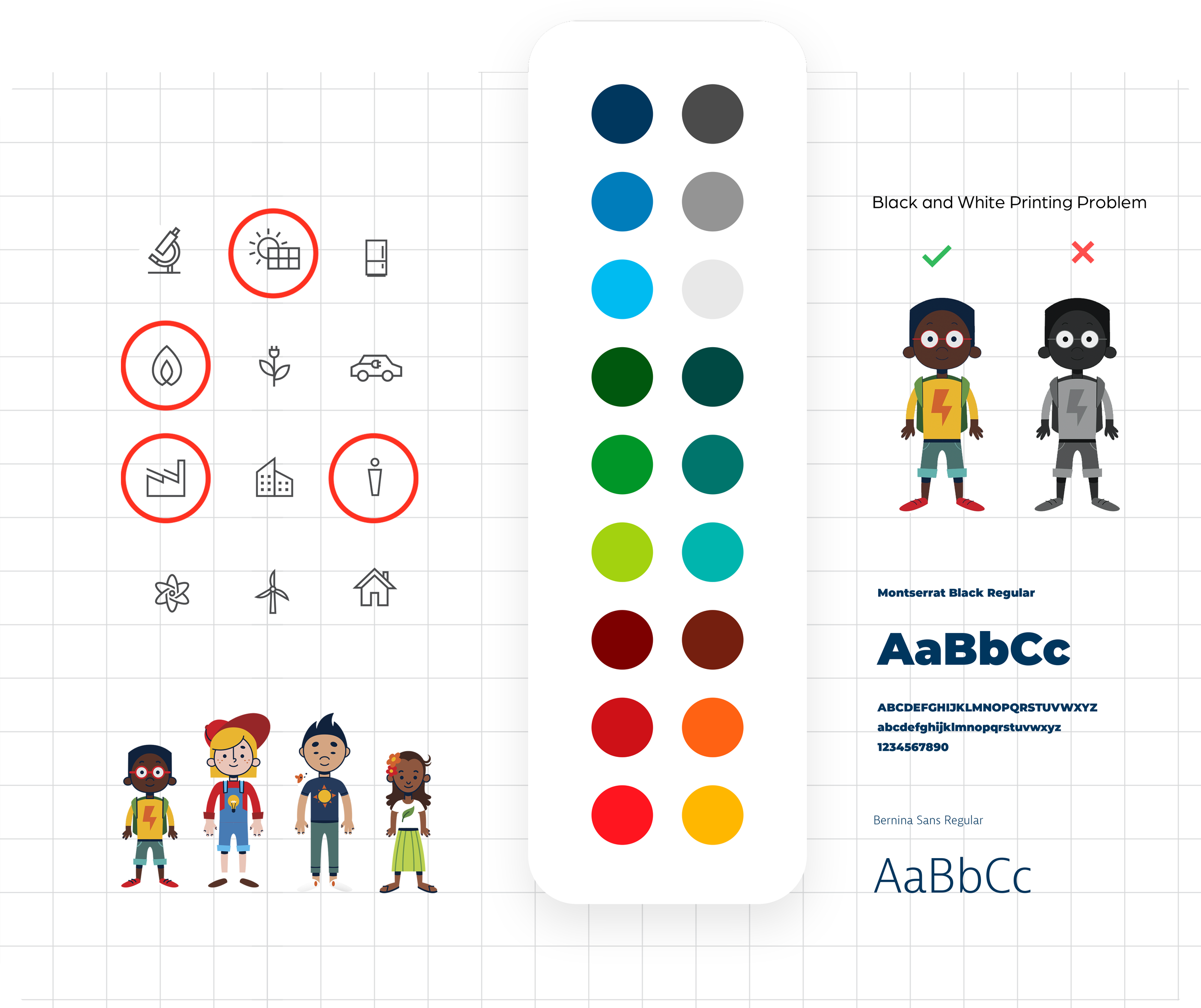
We audited the entire Learning Power brand to extract what’s working and what’s not. We audited the visual brand and core identity to uncover key problems from logo scalability, to color use, icon functionality, and more.
03
Customer Listening
We listened to everyone from stakeholders to teachers statewide to uncover problems behind the scenes. We learned nuanced issues such as contrast issues when they printed worksheets in black and white.
04
Demo Analysis
Learning Power serves everyone from students to teachers. We helped segment their specific demographics and behaviors. The goal was to build out a foundation for how we speak to multiple categories at once with the new build.
Then, we built the brand identity.
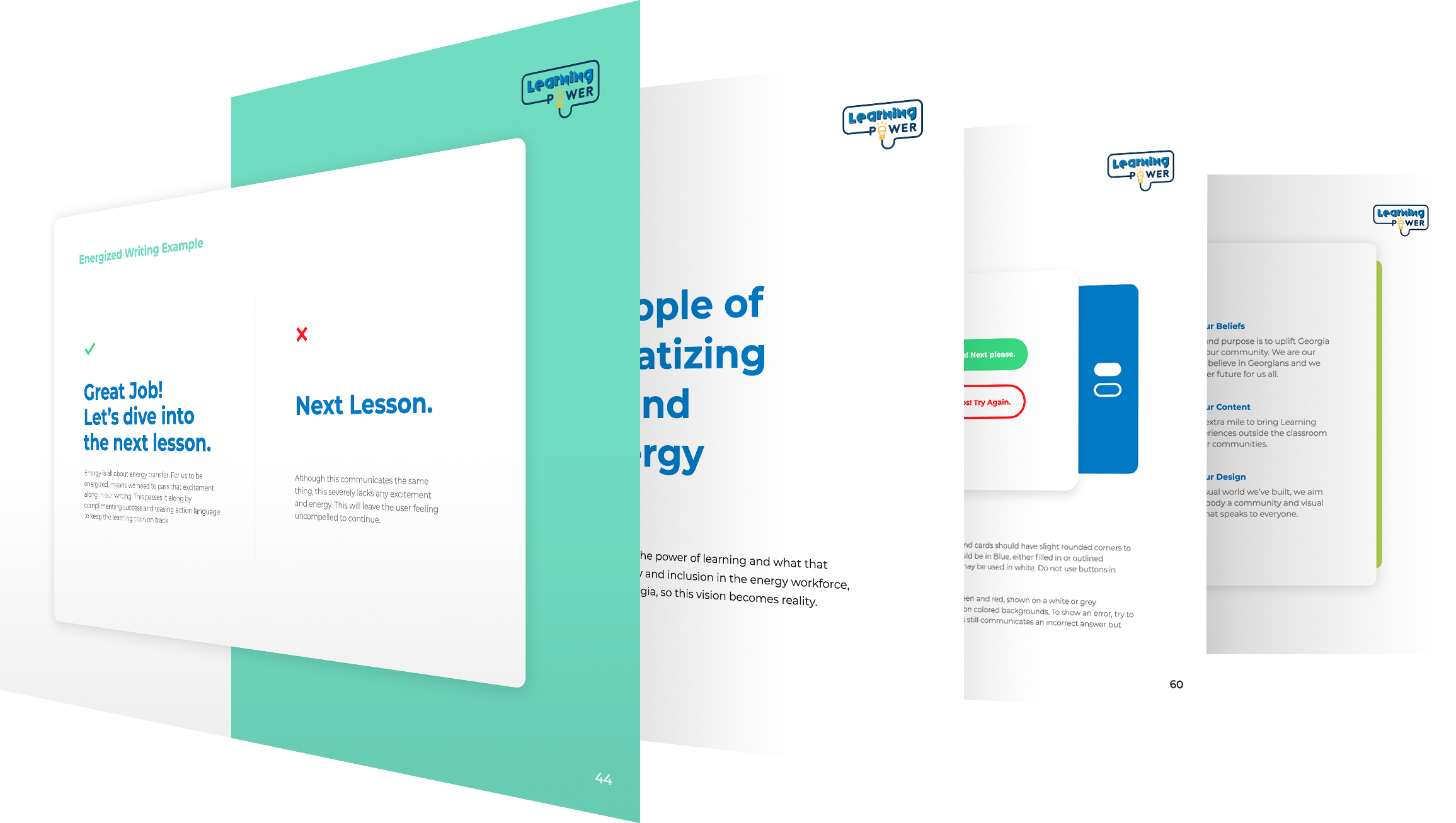
We started with the brand identity, including mission, vision, values and writing rules, complete in a brand book with use case examples and guides. Once we laid the foundation, we set out to build the new visual identity. We first helped them hone their existing logo, create their new icon, + establish use case rules to establish uniformity across the platform.


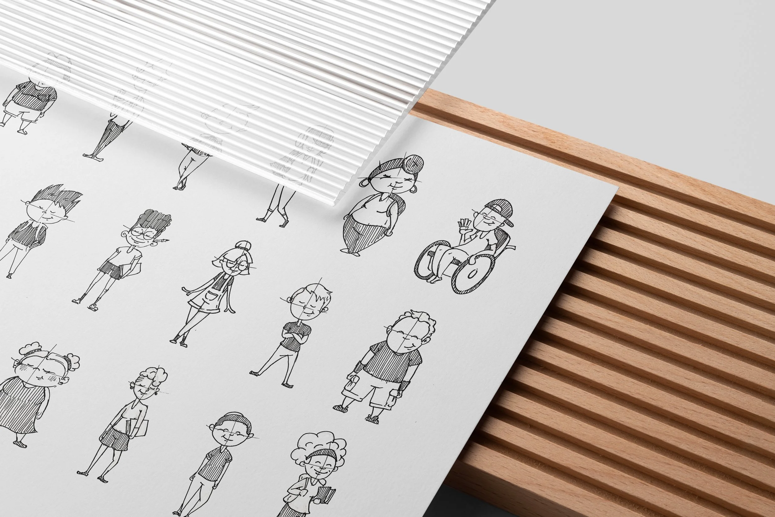
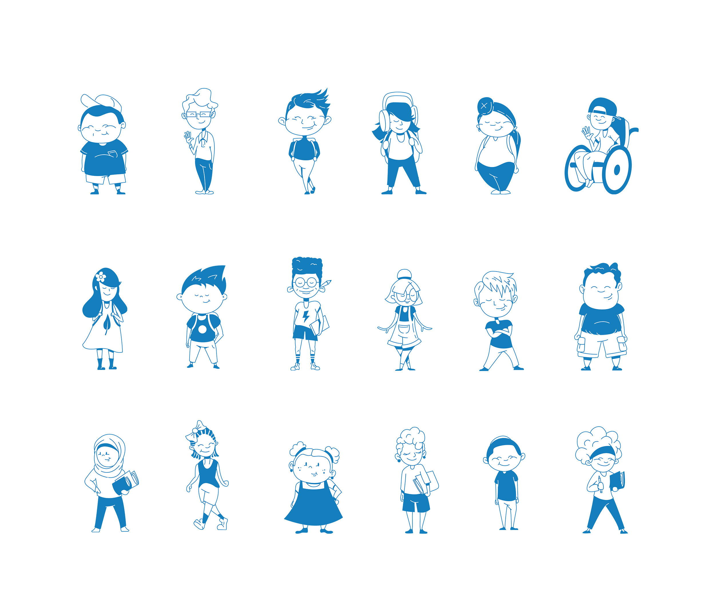
Next, we created the new visual identity. First up, character design.
Character design isn’t about trying to capture everyone and everything in a few people. That’s how you end up with hollow feeling corporate-esque characters. At Learning Power, we built an entire class. Full of real personalities, real culture, real clothes, real hair, individuality, and raw humanity.
The goal is that everyone can see and resonate with some part of these characters. Some may resonate with multiple, and some with just one. As students age through the program, the characters grow too. From worksheets to ads, these we harnessed these characters across the entire brand experience.


A visual language that speaks to all ages.

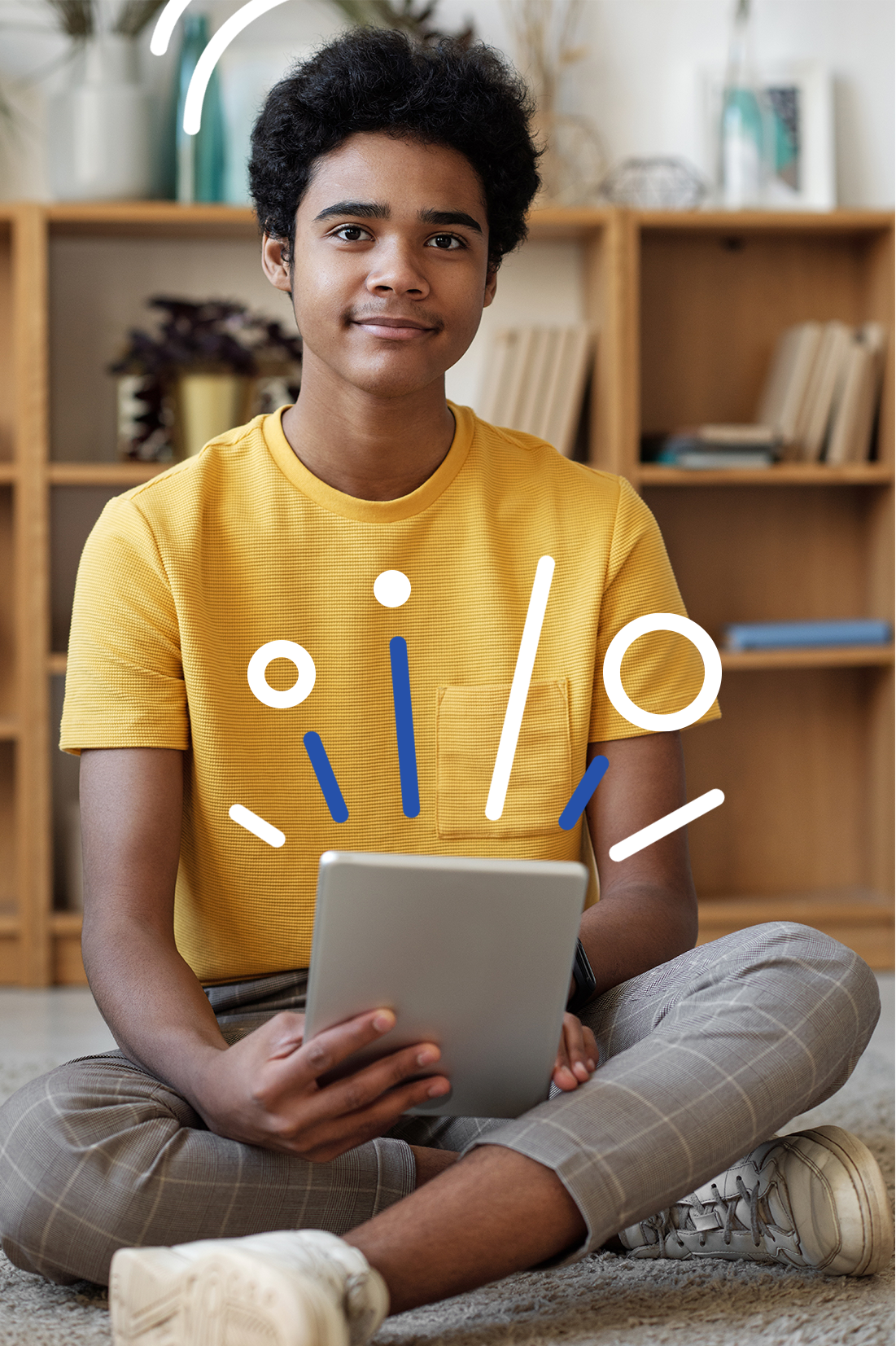
Sometimes, the characters won’t work for outward messaging to teachers or to older students. In these cases, we harness the line work from illustrations and the logo, into something we call energy lines.
These marks are to be used as adornments on photography, to further express movement, energy, and the impact of Learning Power.