

Rainmaker
Making it rain over $21M for Rainmaker Games.
Brief
In December 2021, Rainmaker Launched to the world, unveiling their global portal to gamers. We built their brand, design, and helped them launch, raining in over $21 Million in VC and Crowd Funding.
Deliverables
Branding
Design
Strategy
Web
Video
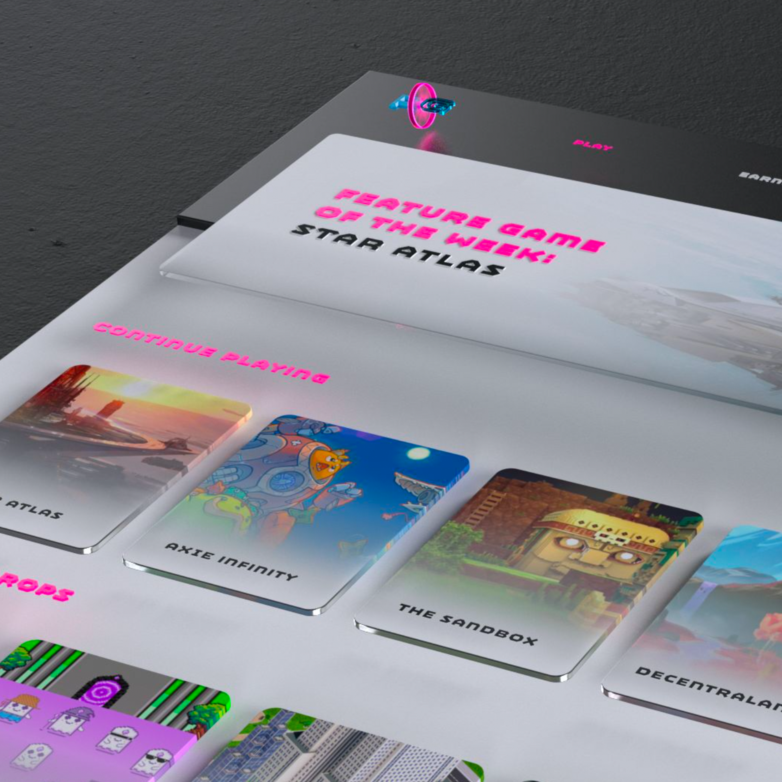
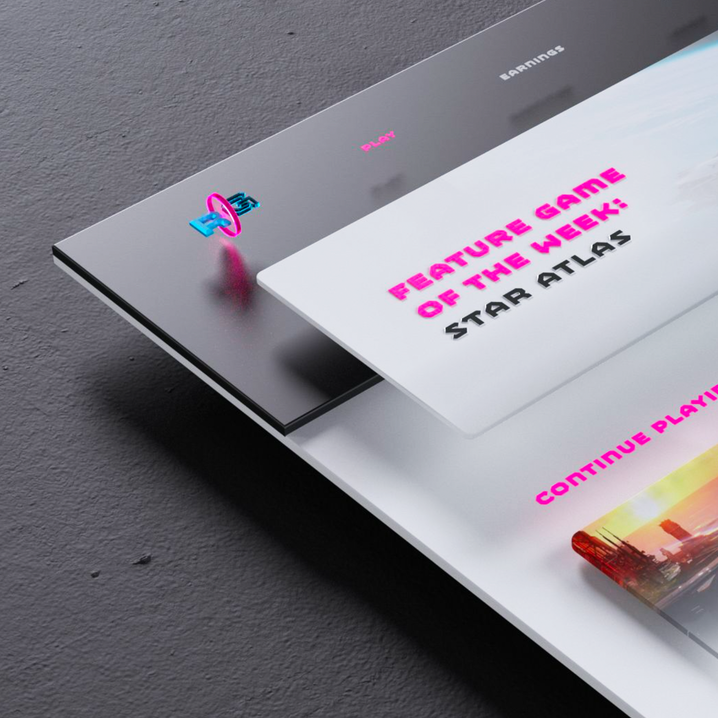

Building the approachable crypto platform.
Where the world plays to earn.
If you aren’t familiar with blockchain gaming and “play-to-earn” mechanics, here’s the one line summary. Gamers play games to win in game items, that are worth real money.
It sounds great but the landscape came with a huge barrier to entry. The crypto world was littered with acronyms and vocabulary that can be difficult to understand. Plus finding which games were worth it and which were scams was nearly impossible. Enter Rainmaker Games - the first global blockchain gaming platform for gamers to discover, earn, and learn like never before. We built everything from the brand to the interface.
Think, Netflix for blockchain games.

Branding the portal to blockchain gaming.
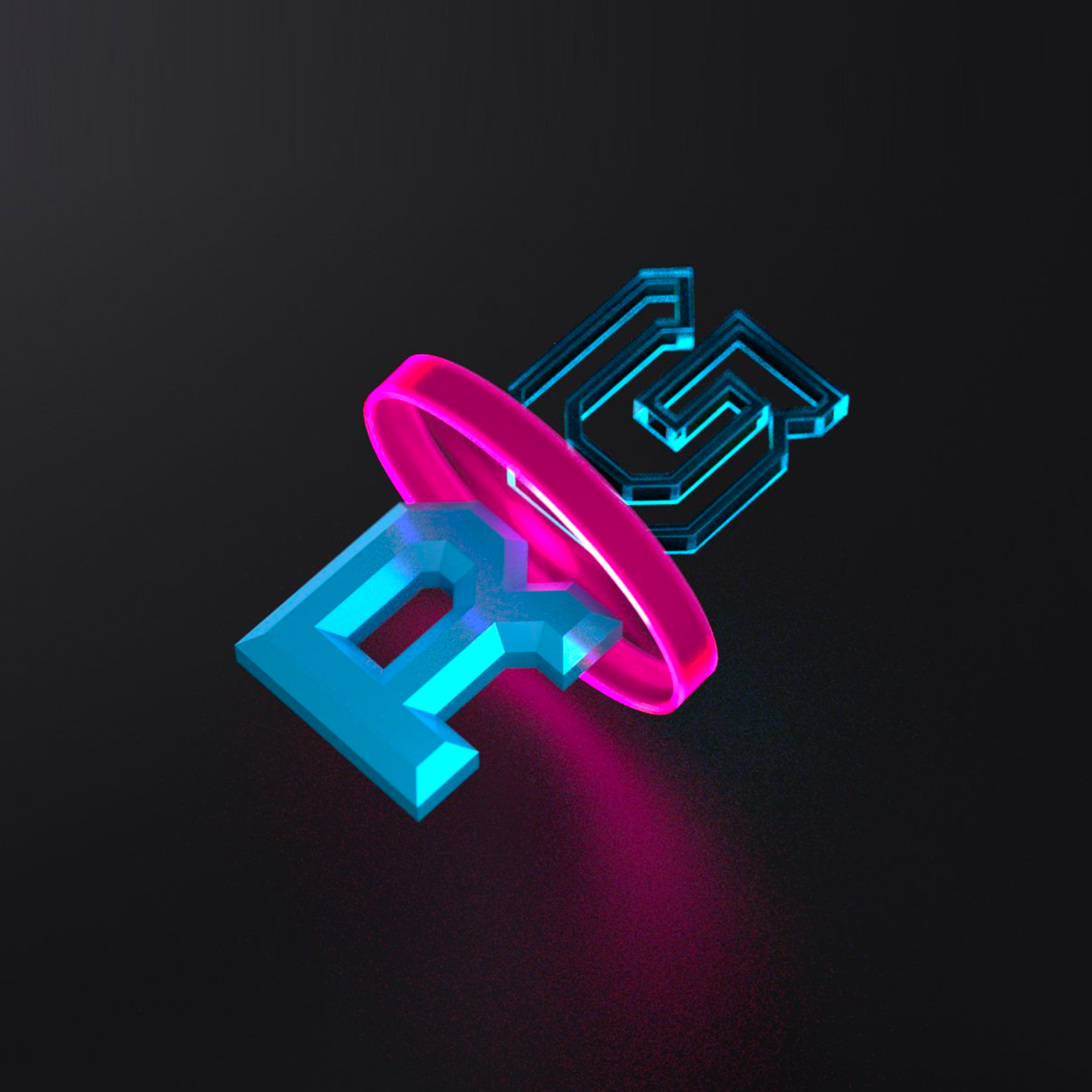
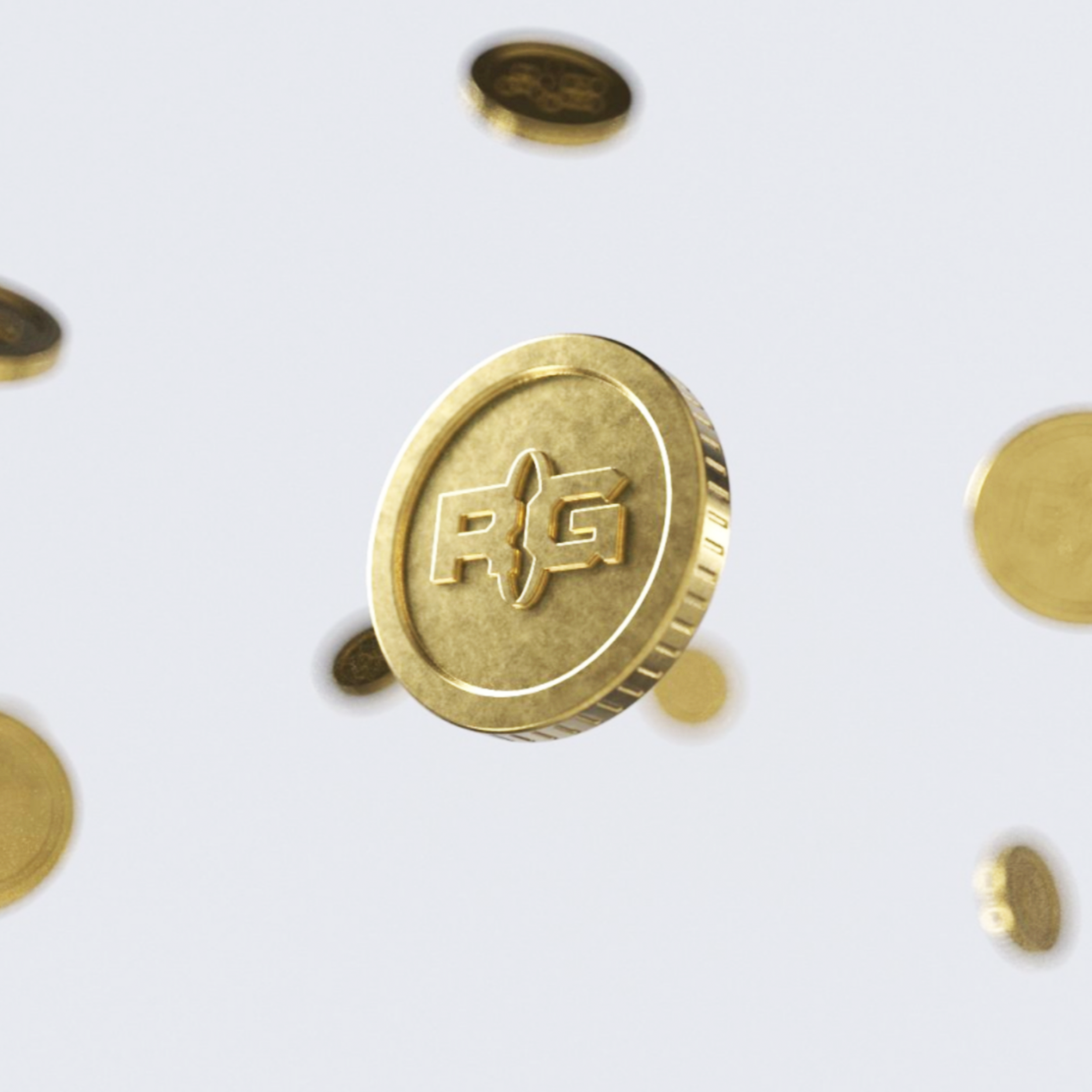
Rainmaker Games served as the portal between the tangible world and intangible gaming world. The logo was designed to be a representation of that core function with the portal (the platform) at the epicenter.
This idea of portal transfer is embodied in the line work of our letters. The "R" represents the tangible monetary world, shown in the cuts and shimmer of our sapphire blue. The "G" is flattened and outlined, alluding to the digital state on the other side of the portal. This duality of finishes subtly communicates our deeper message within a succinct logo mark.


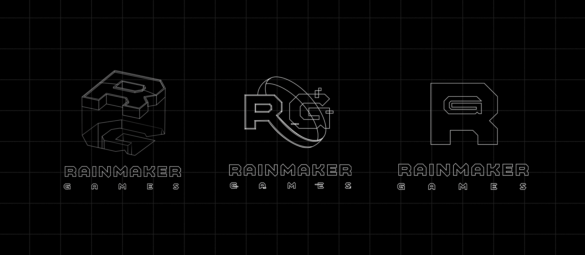
A L T E R N A T E D R A F T I N G C O N C E P T S
Colors, Type, and UI Design.
As a global platform that hosts games and content, Rainmaker’s visual identity had to be unique and memorable, yet can not compete with the games it hosts on platform. The identity is bold and malleable, allowing the games and graphics to shine, while staying authentic and eye catching across the user experience by using color and striking topography to draw your eye to key information.


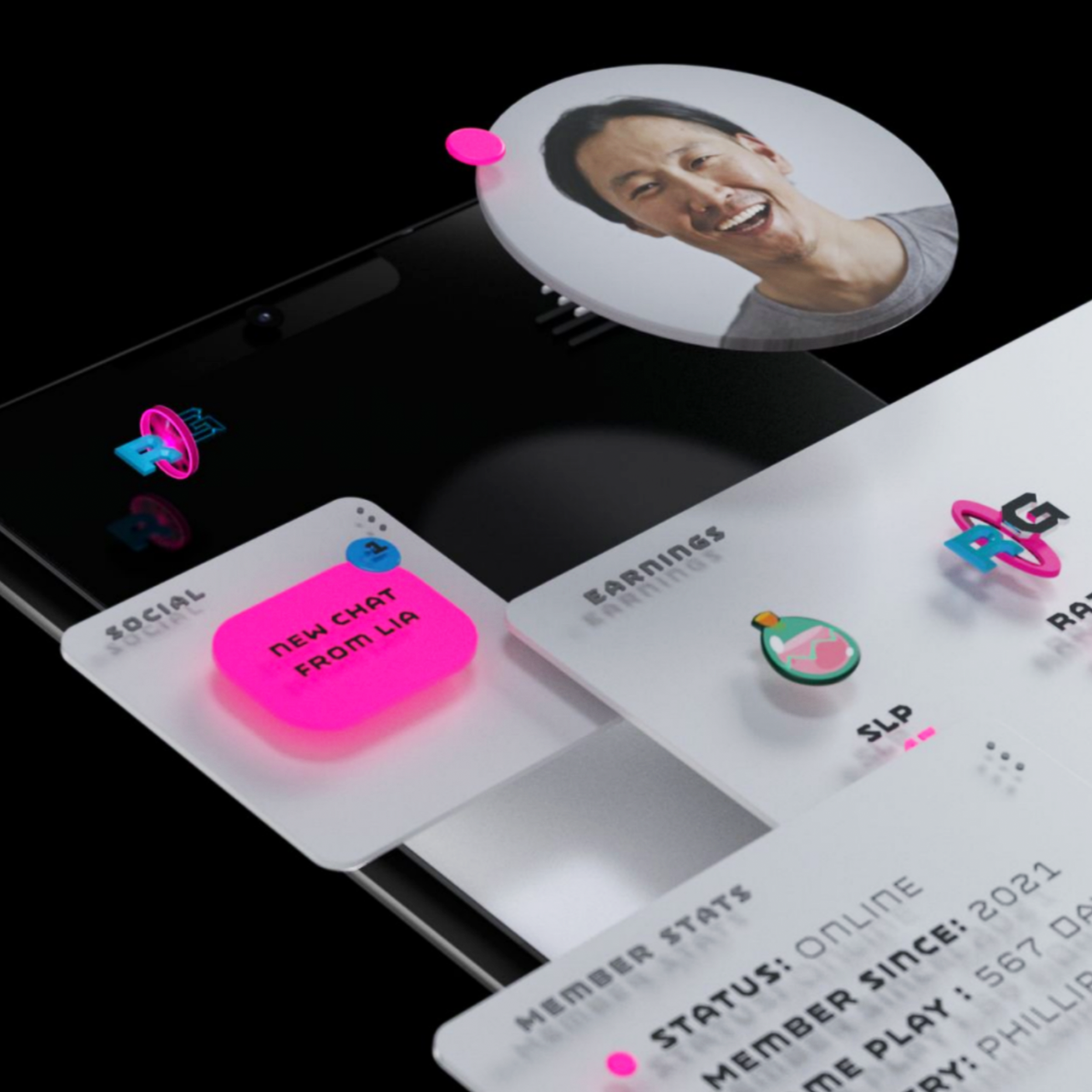
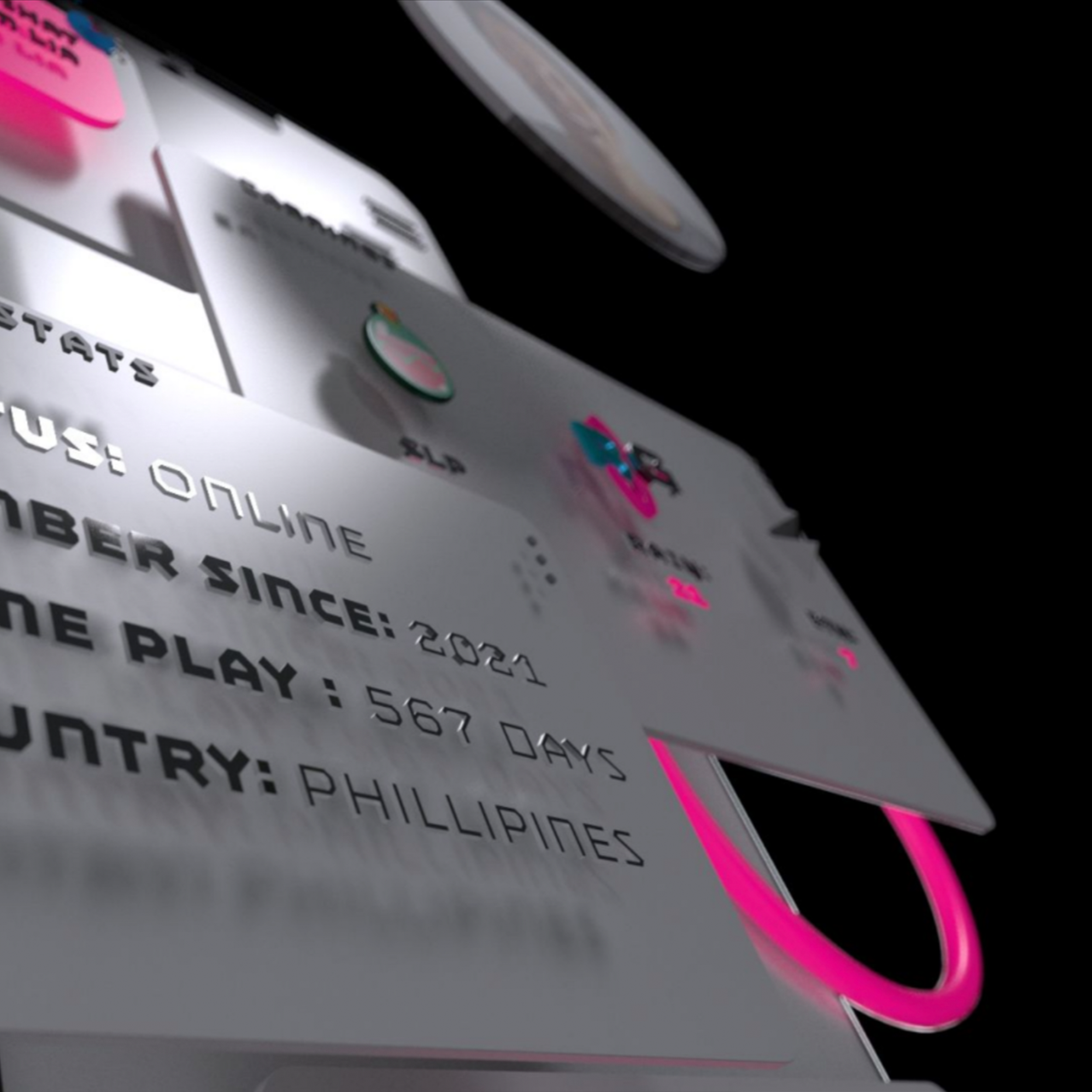
Designing the Platform
Taking inspiration from top streaming platforms, we built the Rainmaker UI to be an easy source for browsing, learning, and playing. The goal was to create simplicity out of a complex function like play to earn gaming, in a sleek, beautiful, and familiar interface.


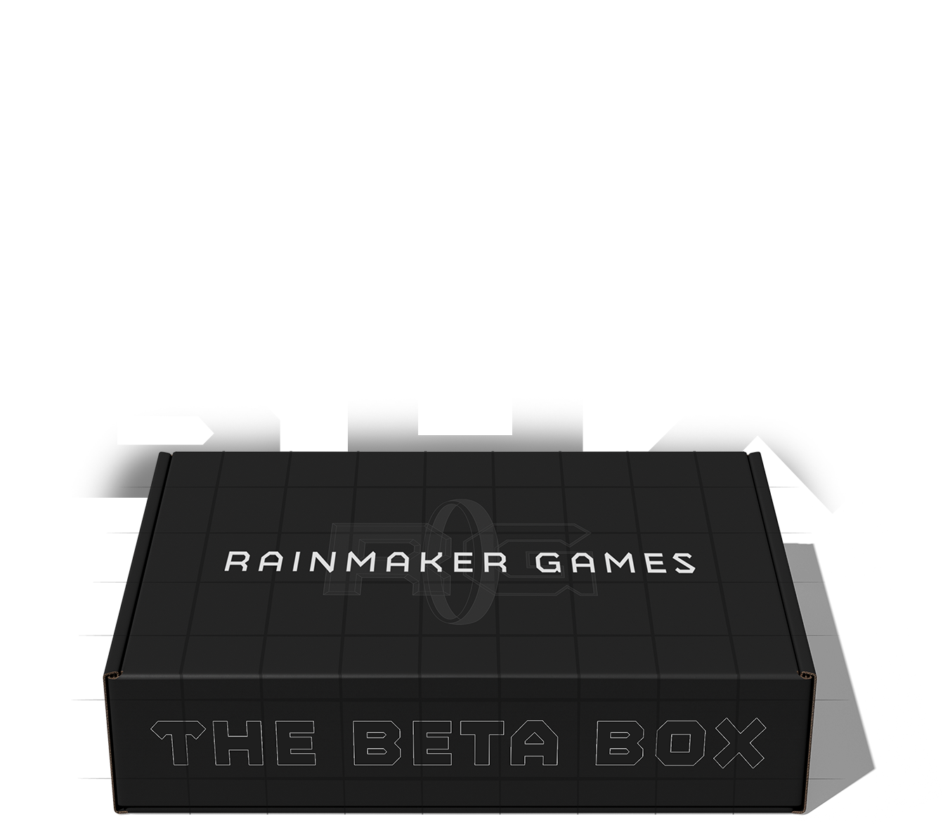
A bold branded beta.
When building an initial adoption base, the goal is to get them to fall in love, in turn becoming ambassadors. Getting them to fall in love isn’t about handing out swag. It’s about making them feel exclusive. It’s about building suspense and enamoring them with surprise and delight at every turn. So instead of simply telling someone they are selected for the Rainmaker beta and handing them a sweatshirt, we made the experience unforgettable.

Meet the Beta Box.
Being selected for Beta should feel like a big deal. We see a lot of brands treat beta testers like guinea pigs, when they have the opportunity to build strong relationships and lifetime brand ambassadors. For Rainmaker’s Beta, we designed custom boxes on a budget, to bring a big impact to the users. Each both congratulated them on their Beta selection, complete with a limited edition Rainmaker Sweatshirt and stickers.

