NuggMD
Reframing wellness for the med card giant, NuggMD.
Brief
Nugg MD is one of the largest medical cannabis card companies in the US. The brand got stale and needed a refresh to grow with the company.
The goal was to keep some familiarity from the original brand, but level up the identity for a better performing brand across every touchpoint.
Deliverables
Rebrand
Strategy
Design
Copy
Web Design
Results
172%
Increase in unique page views
157%
Increase in avg time on page
+7 spot
Increase in avg search results


First, we analyzed the brand to identify opportunities to improve.

Opportunity 1:
The Heart
First we looked at the logo. The heart with a plus is definitely iconic but it’s too generic. There is no unique element to it to act as an identifier for the brand. It was time to redesign the heart in a way that was unique and memorable.
Opportunity 2:
The Typeface
Nugg MD is part of a house of brands including Nugg and Nugg Club. The company wanted to drive traffic bi-directionally between businesses. However, the typeface is inconsistent, making it harder for a customer to see the connection.
Opportunity 3:
The Messaging
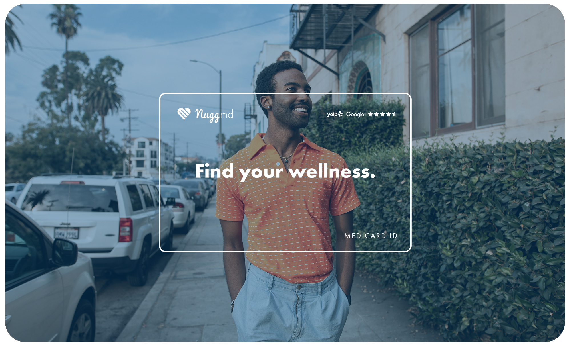
It’s easy to get lost in selling customers a product instead of a solution. A lot of the messaging and photography for NuggMD revolved around the med card and the service, but missed the mark on what it was really solving for people. People want to be rid of aches, pains, anxiety, and whatever else ails them. They want wellness. That’s really what NuggMD is selling.
Then, we began to rebuild and refresh.

We started with the logotype transfer. Simple and effective, here’s what the shift looks like from the original type to a format that follows the other brand structures.
Now we can build familiarity and boost trust and conversion from trust from Nugg MD to Nugg Club.

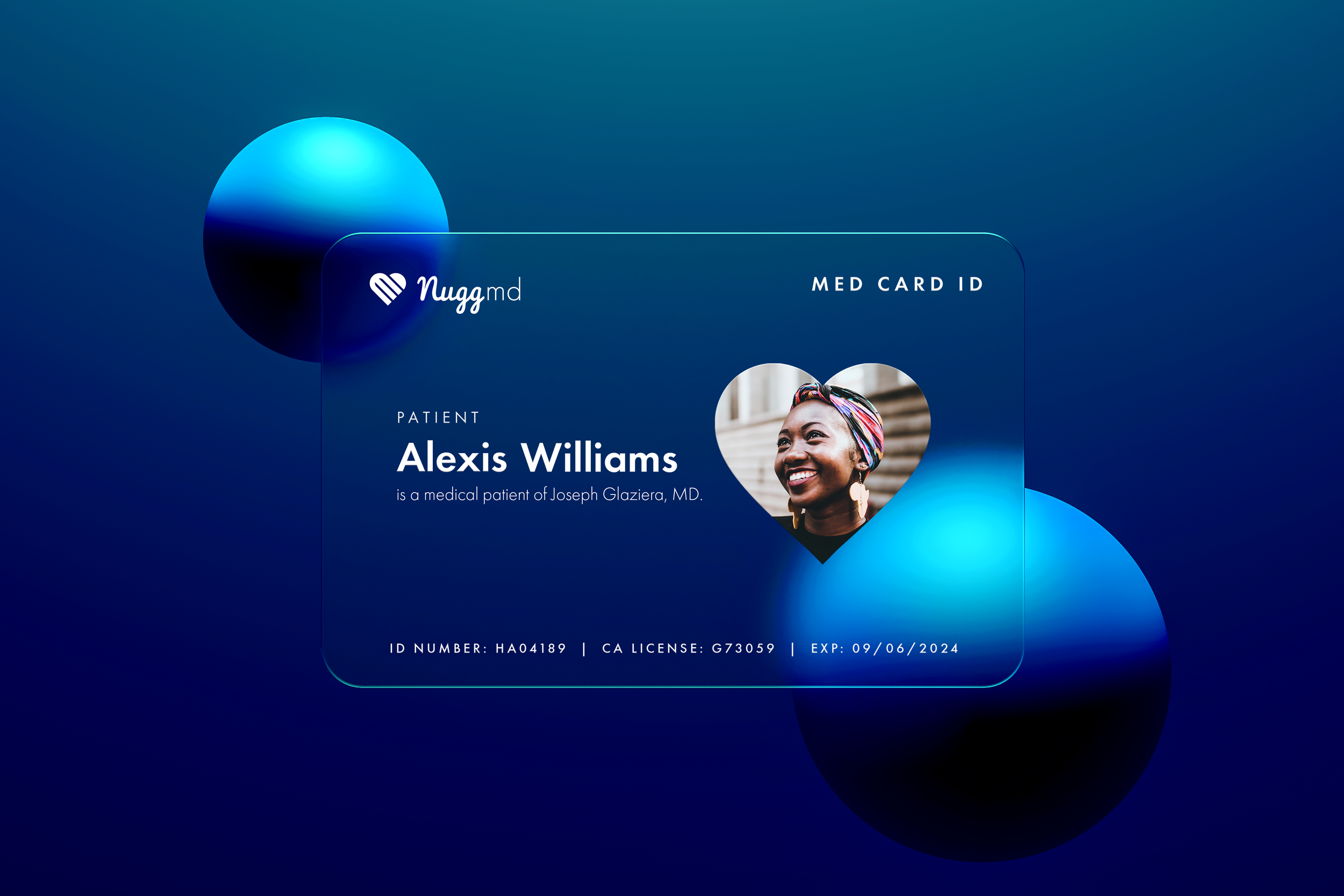
Designing a new heart with “m + d” in mind.
The new logomark started with a the idea to use the letters “m + d” to shape the new heart. We deconstructed the original heart into the letter forms and reconstructed them into a heart that is unique, memorable and original to NuggMD - right down to the letters.


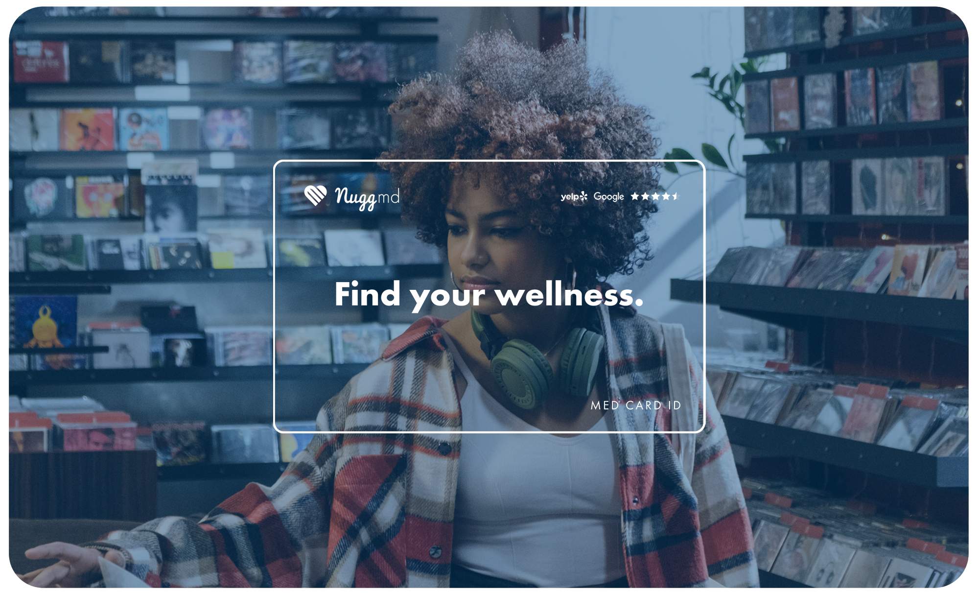
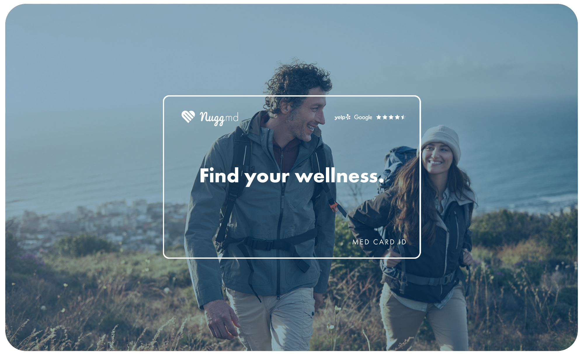
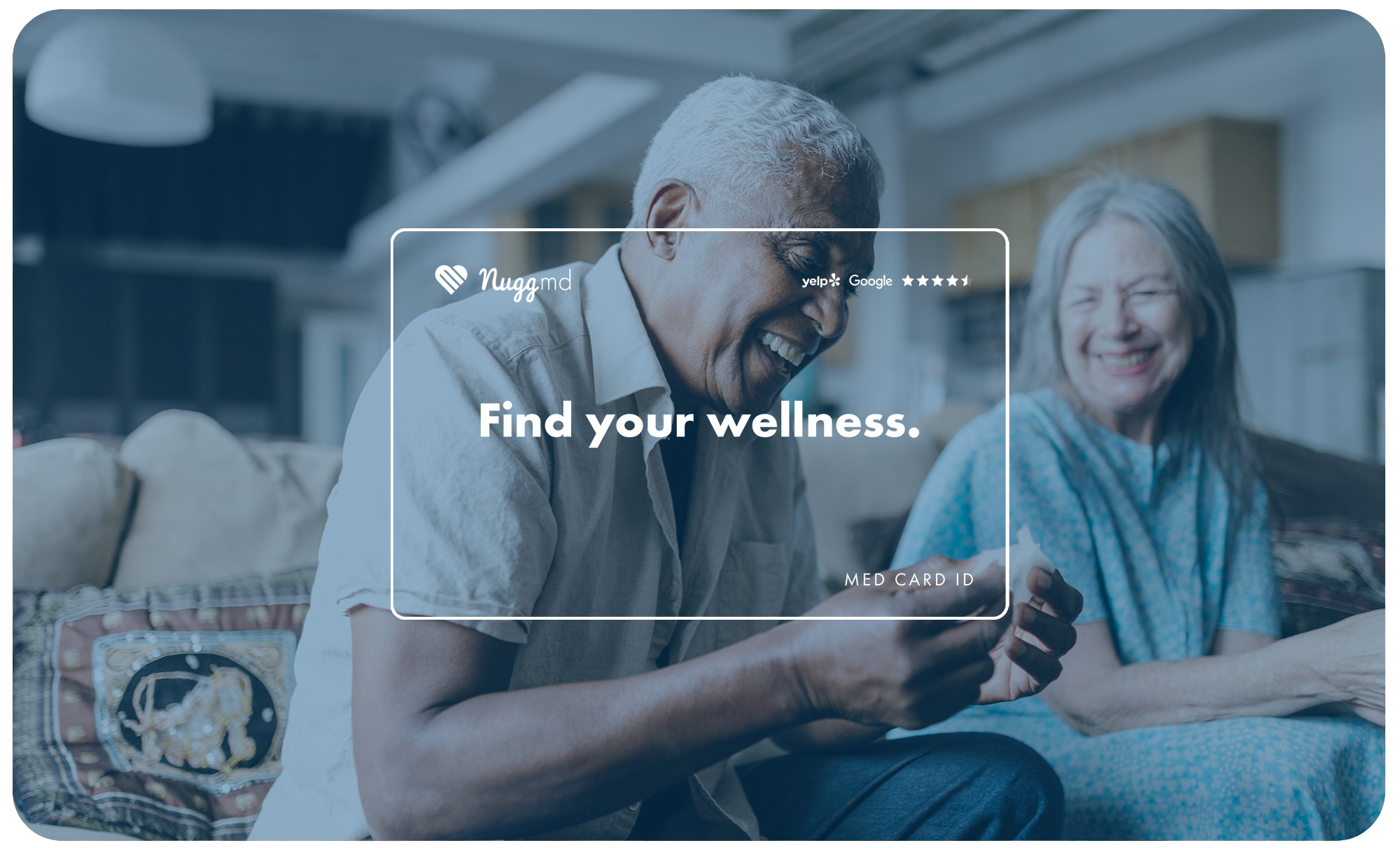
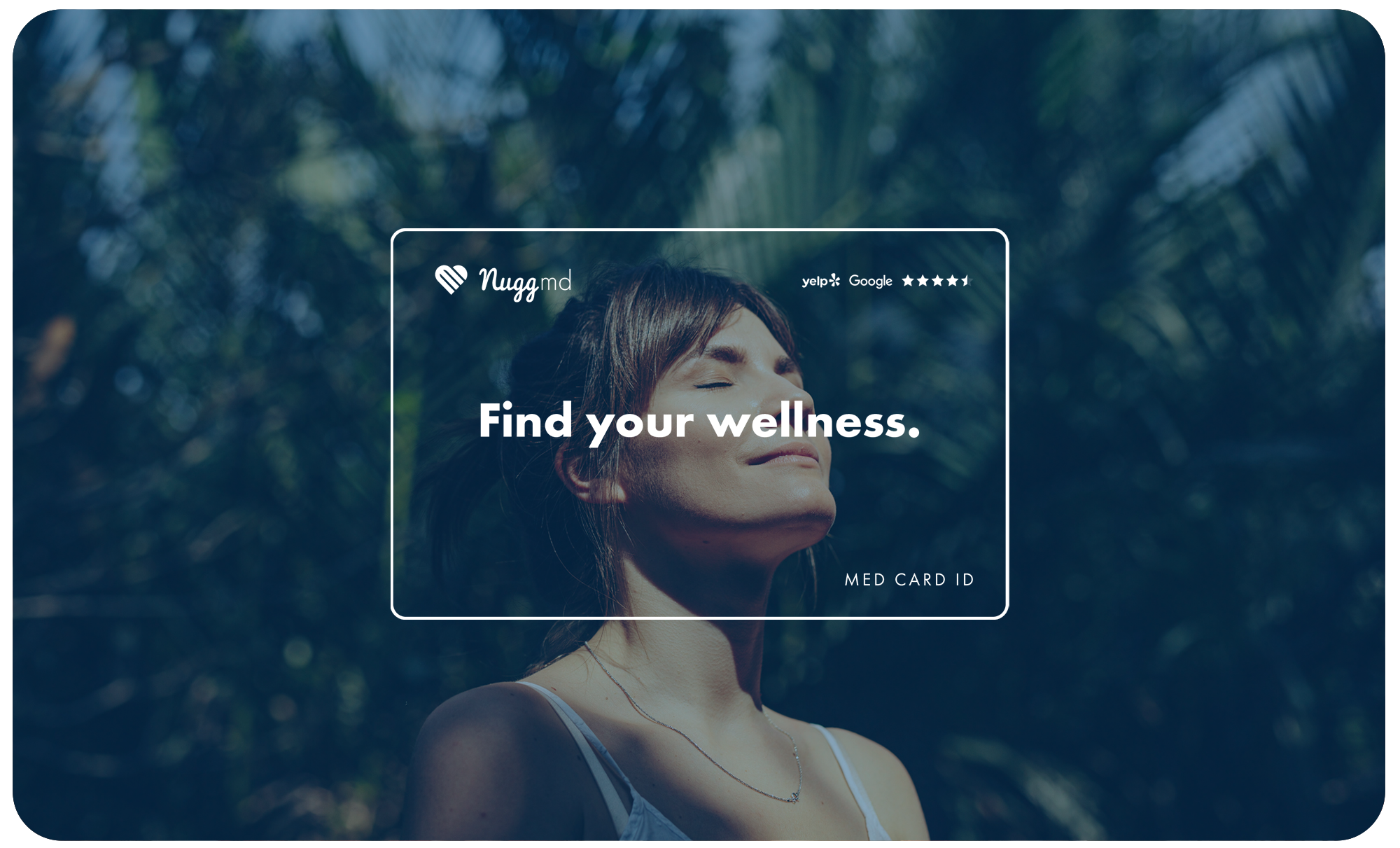
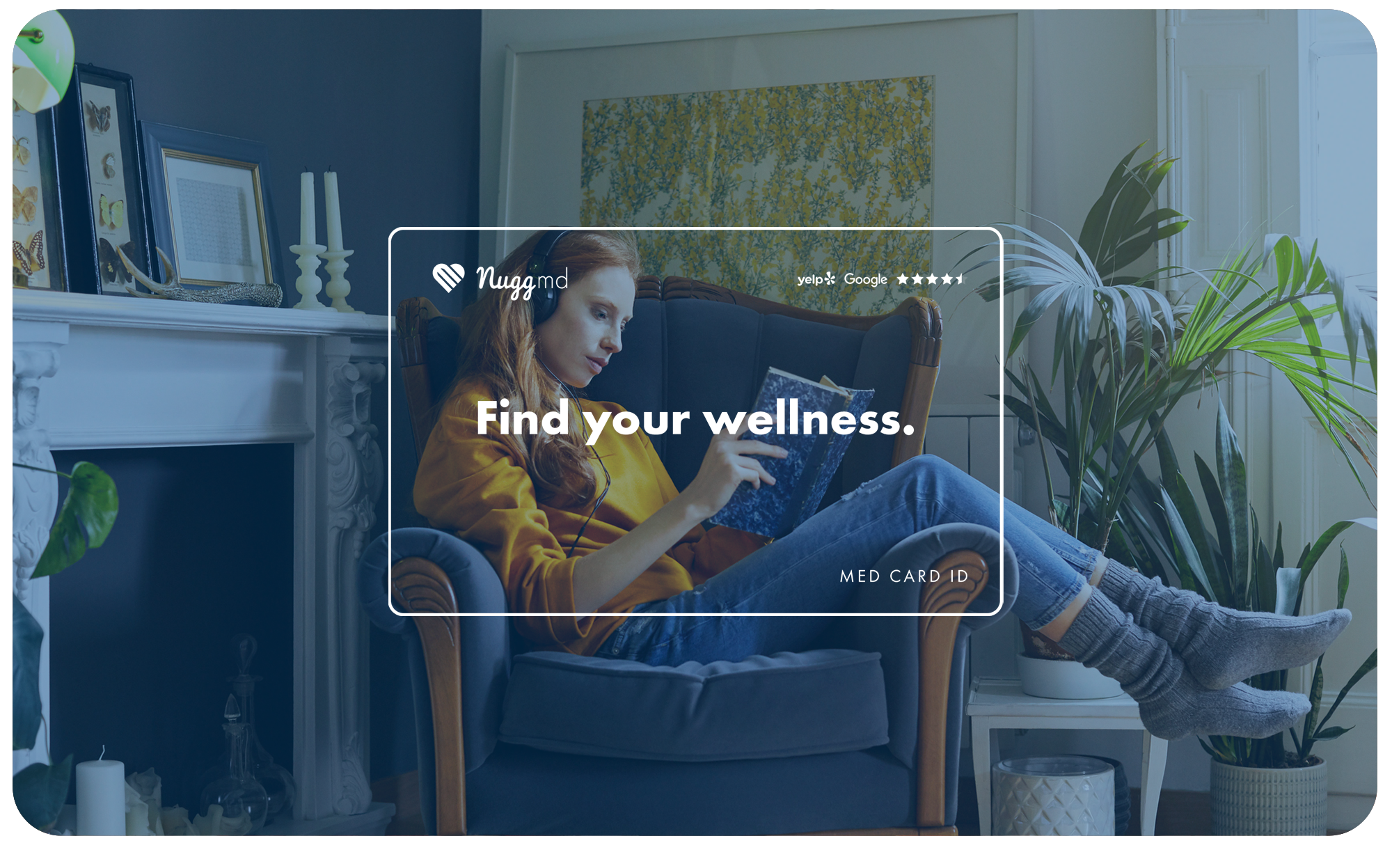
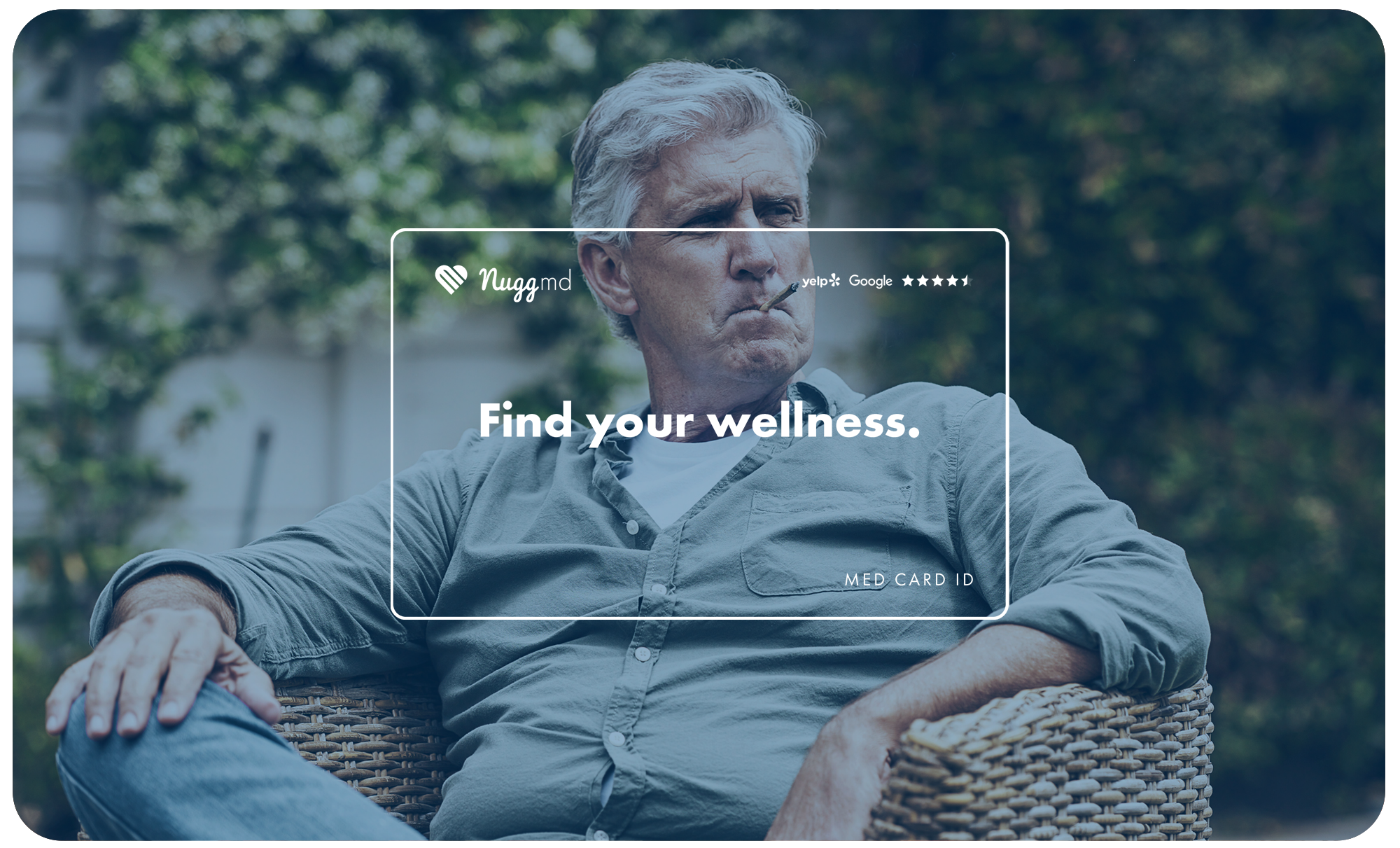
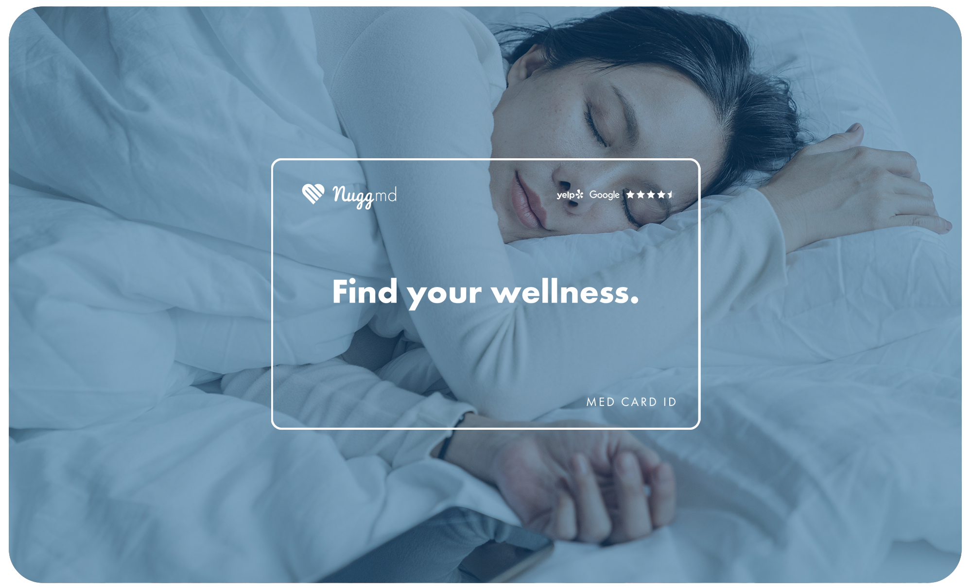
Prioritizing wellness over illness.
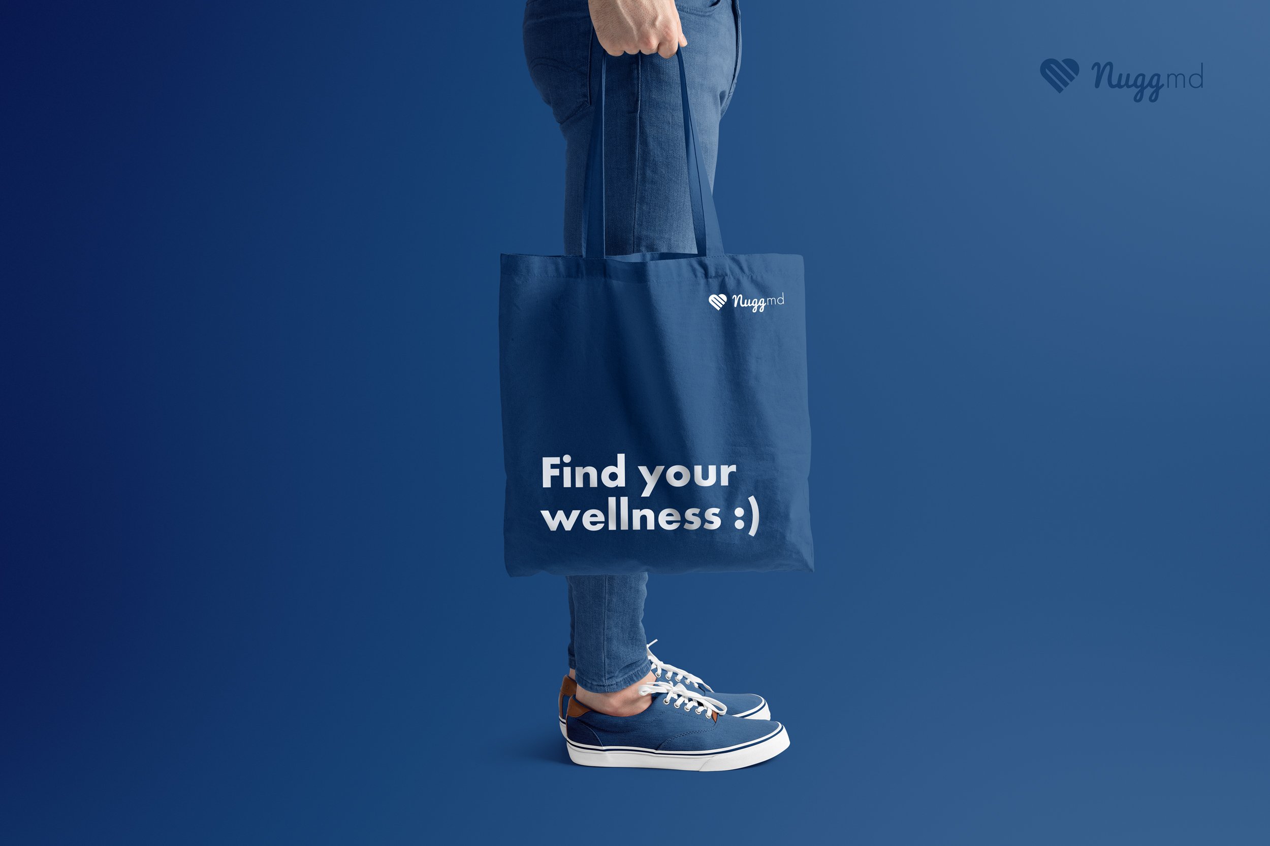
The goal of medical cannabis is to help people with whatever ails them. A lot of NuggMD’s imagery depicted those ailments from pains to depression. With the new direction, we reframed the visual strategy to depict the results of the service, not the pre-existing ailments. We brought that vision across the entire brand experience from print to digital.


A new website design from the ground up.
We took the new brand identity and rebuilt the site to communicate the new vision. It was designed for the user and built for conversion, reaping massive increases across the board from avg time on page to unique page views.:
Avg Google position up from 13 to 6
Unique page views up 172%
Avg time on page up 157%